
I’ve never been a fan of the data cube. In fact, I’ve always disliked it because it seems so constraining. I don’t want to be chained to a certain thought process when I’m analyzing data. Maybe that’s because I try to use a variety of analytical approaches when gaining insight from data.
Recently, Robin Bloor and I have begun to research innovations in Business Intelligence. One of the areas that we’re actively looking into includes new analytical approaches. A few weeks ago, Robin wrote about a company called QlikTech in his blog and I want to add my thoughts about the company to his. Robin discussed the fact that the company’s product, called QlikView builds its data structure in memory on a server using the associated schema information from databases. He said that the power is in that data structure. This means that QlikView can build any multi-dimensional view into that data in a fraction of a second.
Let me build on this because it is important.
As I just mentioned, I never liked cubes. I suppose they served their purpose in that they could provide a multidimensional view, but they lack flexibility. Generally, every time a user wants something new, someone else needs to get involved. This takes time and can be frustrating. With the advent of cheap memory and increased processor speed, this no longer has to be the case. Users shouldn’t have to be constrained. And, this is what QlikView is about.
It’s associative
QlikView reads in data from your company’s data sources into its data structure. QlikView can handle a maximum of 2 billion records per table. The practical limitation is the amount of data which can reside in the RAM of the computer that the QlikView is running on. QlikView compresses the data as it is brought into memory.
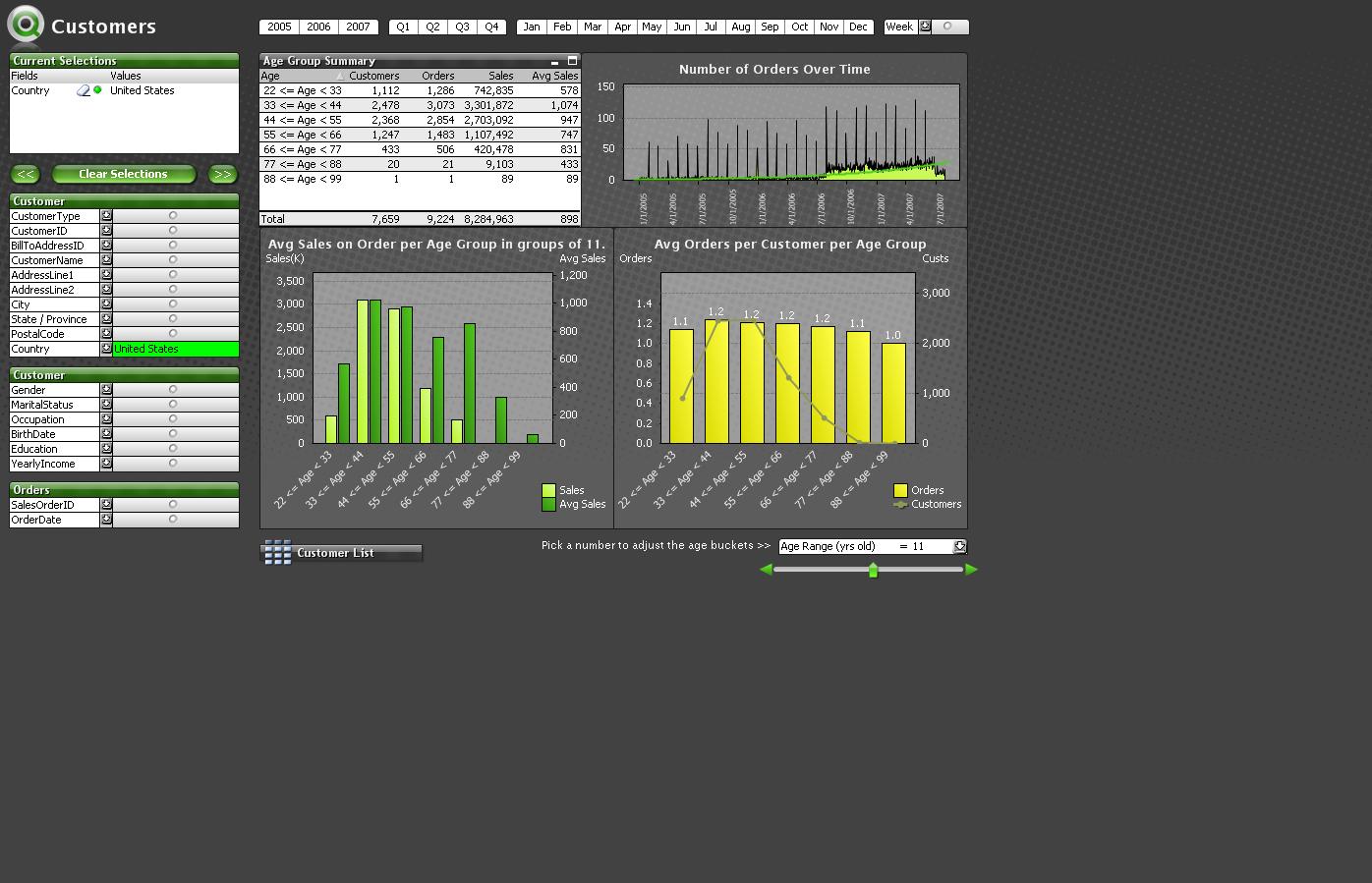
The user can develop various ways to view the data. Here’s a screen shot from QlikView. In this case, we are looking at customers for certain biking-related products . The data consist of information about customers including age, gender, marital status, the country they reside in, orders, spend, what category of product they bought, sub categories, etc. The data are available for the years 2005-2007. The view here consists of charts and plots that were created on the fly to examine how age affects purchase. Various plotting and charting options are available in QlikView.
The list boxes on the left of the screen show that the analysis concerns customers in the United States only – although the data exists to look across various countries. My view examines the years 2005-2007 (seen on the top of the screen). My charts and plots indicate that most of the sales come from two age agroups 22-33 and 33-44, which also have the highest average sale, although there are some interesting patterns in the avg sales figures for older customers. Other charts are indicating some interesting statistics regarding orders per customer.
 Here’s
Here’s the associative part. This view may lead me to ask the question, “Has it been like this every year?” or any other question for that matter. The beauty of the QlikView approach is that the data to ask all sorts of additional questions is at my fingertips. So, let’s assume I want to look at what happened in 2007 only. I simply select 2007 and presto, the view changes immediately to examine this year in particular. The screen shot below illustrates this. You can see the changes to the plots and charts and the fact that data is only available for part of the year (the other months are grayed out). I note any pattern changes here and then I decide to look at 2006 and then 2005 – you get the idea.
 The in memory advantage
This is a simple example. But, what I like about QlikView is that I can create different views on the fly and examine the data in different ways – instantaneously- because the data is in memory and the calculations are done when I need them.
I couldn’t do this with a cube.

Leave a comment